.png)
<aside> 🎬 This is an article written during the product creation period, recording some of my journey since making PassLock. Since I am currently the only one in the entire team, I do everything myself, including product drafting, UI design, R&D, testing, copywriting, etc. Many solutions have to be scrapped after completion because they do not meet my high standards. ,again and again. Since I only have 1-2 hours after get off work on weekdays, the entire creative process is actually very difficult. Therefore, I think it is necessary to record this unforgettable creative process in writing, just like the behind-the-scenes footage of a movie or record.
</aside>
Today is August 8, 2023, 00:08 pm, the beginning of autumn. The room was quiet 💤. Outside the house, the sound of hammering steel from the construction site that had been ringing all day has long since stopped. Every night after get off work, I take the subway to end my day's work, travel across half of the city, come home and turn on my computer to start another "job" of mine. This has been going on for more than half a year. Since the establishment of the project, many things have been changed and changed in order to meet the real needs of users and optimize the experience as much as possible. The whole process was full of sadness, anxiety, and pain.
.png)
Balcony night view at 3am
Because there are indie musicians in this world (such as Bob Dylan, Hozier, Leonard Cohen, etc.), there should also be independent developers. In addition to being able to complete lyrics, music and singing independently, they also insist on original music. I believe that most of their lyrics and music scores have been revised and polished repeatedly before release. As I am now making repeated modifications to PassLock, the whole process is not easy. Below, I will record some cases that I think were very memorable for me at the time.
I meaning, brand design. The first question is what should the software name and LOGO be? At first PassLock was called "Passbook", which was a cool name, just like Facebook. Later, during the development period, I always felt that it was not very good. After about half a month of consideration, I finally chose the latter between "PassGuard" and "PassLock". The problem with the LOGO was actually not the current purple style at the beginning, but the dark style. The dark style may be more in line with the product's positioning, but it seems too low-key. Around July, I considered that the logo should be eye-catching on the App Store, so I spent two nights redesigning the logo. Of course, it also includes the redesign of those copied icons, and adds some glossy albums to give it a 3D feel. The 3D feel is also the design style that closely follows iOS17 and the upcoming Vision that may be adapted.

Attached is the newly redesigned logo.
For "PassLock", this should be the most important principle issue. You may tolerate an ugly design and a poor experience, but you cannot tolerate data security issues. Therefore, from the design of iCloud private database, decentralized storage, and data encryption, these principle issues have been taken into consideration as much as possible. This has also ruined our idea of being compatible with Android, Windows and other platforms, at least now it will not be compatible. Tolerant. I wrote in another article 「🔐How to ensure the security of data? 」Specifies in detail the efforts we have made to ensure the security of your data regarding security issues.
From the beginning, we positioned "PassLock" as a privacy and security guardian in the Apple ecosystem, so it must be compatible with iPhone, iPad and Mac. Adapting to multiple screens means I will spend extra development time. The multiple windows, adaptive scaling, and special layout on the Mac, and the horizontal and vertical screens on the iPad all drive up research and development costs.
During development, since I was the only one on the team, everything had to be done by myself. Considering that this is a highly private product, I dare not release a half-finished product and treat early users as guinea pigs. This is extremely irresponsible behavior. Therefore, many functions have been developed with as much consideration as possible. Here are some points that have made me change them again and again.
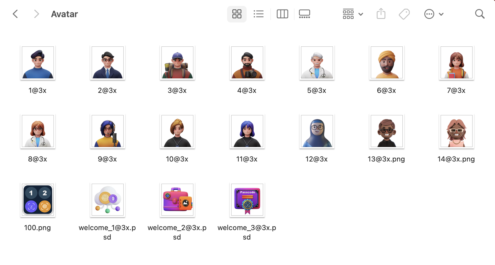
The earliest idea was that users do not need to log in and can directly register and log in by default. However, if they do not log in, Apple reviewers, App Store editors, and some of you will definitely feel that this product is not rigorous enough, so we finally decided to integrate the Apple ID login method. . The second is the issue of user information. What information should be designed for users? Nicknames and avatars are essential, because these are very basic and can make it easier for users to distinguish which account they are currently logged in to. At first, there were only a few local icons, and users could not select pictures in the album, because this involved another relatively troublesome technical point. After doing all this, I found that the avatars provided locally were too ugly, so I made some rectifications and came up with the current set of avatar icons.
